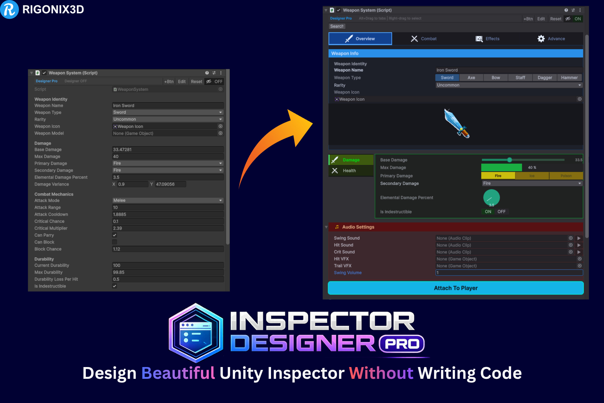
Inspector Designer Pro: The Complete Visual Inspector Customization Tool for Unity
Stop writing boilerplate custom editor code. Inspector Designer Pro lets you fully customize any MonoBehaviour inspector through a visual editor window, no C# scripting, no custom drawers, no PropertyAttributes. Just right-click any field, pick your options, and see results instantly.
Whether you're a solo indie developer, a technical artist on a AAA team, or a designer who needs clean, organized inspectors, this tool saves hours of editor scripting and keeps your project inspectors consistent, readable, and professional.
[DOCUMENTATION] | [VIDEO TUTORIAL]
KEY FEATURES
Visual Inspector Editor — Zero Code Required
Customize any MonoBehaviour inspector from a dedicated editor window or directly through right-click context menus. Change field types, colors, fonts, grouping, layout, and validation — all saved as reusable ScriptableObject profiles.
12 Built-In Field Type Overrides
Transform how your fields are displayed in the inspector. Override any compatible field with:
- Slider — with custom fill, track, and thumb colors
- Min-Max Slider — dual-handle range selection for float pairs
- Progress Bar — visual percentage display with custom colors and format labels
- Knob — rotary dial control for numeric values
- Curve Editor — inline AnimationCurve editing
- Percentage Field — display floats as percentages
- Toggle Button — stylized on/off switch replacing default checkboxes
- Dropdown — styled enum popup with custom background and text colors
- Button Tabs — toolbar-style tab selector for enums and ints with full color theming
- Reorderable List — drag-and-drop list management for arrays
- Image Preview — inline texture/sprite preview with adjustable height
Smart type filtering ensures you only see field types compatible with each property — no guesswork, no errors.
Tab Groups with Full Styling
Organize fields into tabbed layouts with three orientation modes: Horizontal, Vertical, and Icon-Only. Every visual detail is customizable:
- Active and inactive tab colors
- Tab text colors and font size
- Tab bar background color
- Selected tab outline color and width
- Content area background, border color, and border width
- Gradient backgrounds with custom start and end colors
- Per-tab content styling overrides
- Custom tab height and padding
Foldout Groups with Header & Content Styling
Group related fields under collapsible foldouts with full visual control:
- Header background and text color
- Font size and bold toggle
- Built-in icon picker for header icons
- Content area background color
- Content border color and width
- Content padding
Headers, Separators & Layout Elements
Insert visual structure between fields:
- Headers — with custom background color, text color, font size, bold styling, and built-in icons
- Separators — horizontal dividers to visually separate sections
- Spaces — adjustable vertical spacing
- Box Groups — bordered containers with background and border color
Custom Buttons with Rounded Corners
Add clickable buttons to your inspector that call any public method on the target component. Full styling control over:
- Button label and target method name
- Background color, text color, and outline color
- Corner radius for rounded buttons
- Custom width, height, font size, and bold toggle
- Flexible placement — before any field or at the bottom of the inspector
AudioClip In-Editor Playback
AudioClip fields get an automatic play/stop button right next to the object field. Preview audio clips directly in the inspector without entering Play mode.
Dropdown Styling
Override the default Unity enum dropdown appearance with custom background and text colors. A custom-drawn dropdown arrow ensures visibility regardless of your color choices.
Field Styling & Appearance
Per-field visual customization including:
- Font color, size, bold, and italic
- Background color
- Text alignment (left, center, right)
Description sourced from the Unity Asset Store listing.